How Typography Was Used to Advancing Communication
Typography Used Advancing Communication
Typography, as the art and skill of arranging type to enhance the visual appeal and readability of written language, has played a pivotal role in advancing communication throughout history.
From ancient manuscripts to modern digital interfaces, typography has shaped how we read, comprehend, and engage with written content.
We will dive into the historical background of typography here, its significance in communication, its role in branding and marketing, the psychology behind font choices, best practices for using typography, and the future of this ever-evolving field.
Introduction
Typography is not merely about selecting fonts.
It encompasses weighing letterforms, spacing, and overall visual presentation.
Its importance lies in enhancing the readability and comprehension of written content and conveying emotions and tone.
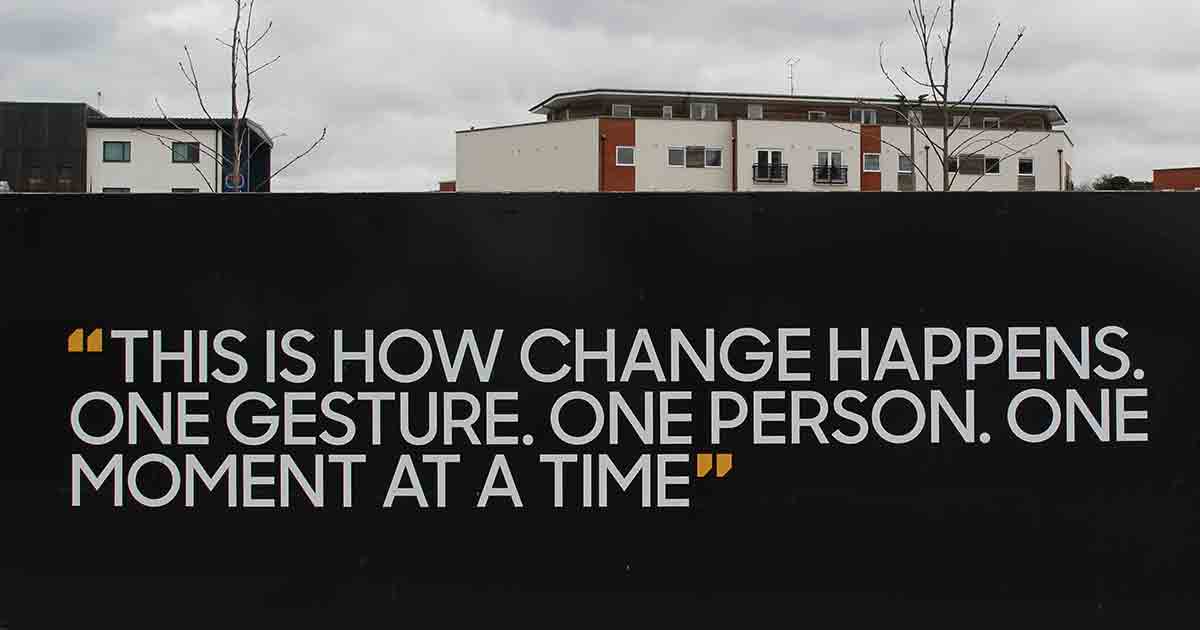
Effective typography can captivate readers and guide them through text effortlessly.
Historical Development of Typography
Typography can trace its roots back to ancient civilizations, where handwritten texts were inscribed on various materials.
However, Johannes Gutenberg’s invention of the printing press in the 15th century revolutionized the world of typography.
The ability to mass-produce printed materials led to the standardization of typographic styles, such as the famous Gutenberg Bible.
Over the centuries, typography has evolved significantly, influenced by cultural shifts, artistic movements, and technological advancements.
From the ornate letterforms of the Renaissance to the sleek and minimalistic styles of the Modernist era, typography has constantly adapted to reflect the aesthetics and values of its time.

Typography’s Role in Communication
Typography serves as a crucial tool for effective communication.
By carefully selecting fonts, adjusting sizes, and arranging text elements, designers can improve readability, create visual hierarchy, and evoke specific emotions.
The choice of typography can influence how readers perceive and interpret a message, whether a newspaper article, a novel, or an advertisement.
Regarding readability, typography affects letter spacing, line length, and font choice.
Adequately spaced and legible typefaces can prevent eye strain and facilitate a smoother reading experience.
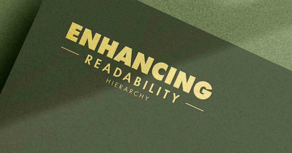
Typography helps establish a visual hierarchy by utilizing variations in font sizes, weights, and styles, guiding readers through the content and highlighting essential information.
Typography also conveys emotions and sets the tone for the text.
With their classical and traditional associations, Serif fonts may be employed in formal documents or to evoke a sense of history.
Sans-serif fonts often convey modernity, simplicity, and informality.
By carefully selecting fonts, designers can align the visual presentation with the intended emotional response.
Typography in the Digital Age
With the rise of digital platforms, typography has found a new playground.
Web typography, in particular, has become a specialized field that addresses the challenges of displaying text on various devices and screen sizes.
The availability of digital fonts and the ability to embed custom fonts on websites have expanded designers’ choices and creativity.
Responsive typography is another essential aspect of the digital age.
As content is accessed across different devices, typography must adapt to ensure optimal legibility and aesthetics.
Designers employ fluid typography, which adjusts font sizes based on screen dimensions, to create a consistent and engaging reading experience.
Typography is vital in user interface (UI) design.
Clear, intuitive, and aesthetically pleasing typography improves usability and enhances user experience.
From app interfaces to websites, typography acts as a navigational aid, guiding users and enabling seamless interactions.
Importance of Typography in Branding and Marketing
In branding and marketing, typography takes center stage in establishing brand identity and conveying messages to target audiences.
Logos, taglines, and advertisements rely heavily on typography to evoke emotions, create recognition, and differentiate brands from competitors.
When designing a logo or brand identity, typographic choices can convey a brand’s personality, values, and positioning.
Serif fonts may communicate tradition, reliability, and sophistication, while sans-serif fonts often signal modernity, innovation, and approachability.
Carefully selecting and pairing fonts create a cohesive and memorable brand image.
Typography in marketing materials, such as brochures, advertisements, and websites, influences user engagement.
Eye-catching headlines, well-structured layouts, and harmonious typographic combinations capture attention and encourage readers to delve deeper into the content.
Typography’s impact on readability and emotional response ultimately affects the effectiveness of campaigns.
The Psychology of Typography
Typography’s influence goes beyond aesthetics and functionality.
It extends to psychology.
The choice of fonts can evoke specific emotions, influence perceptions, and create associations in readers’ minds.
Font choice plays a significant role in shaping perceptions.
For example, a bold and assertive font may convey confidence and authority, while a handwritten or script font can evoke a sense of personal connection and warmth.
Using color and contrast in typography further enhances emotional responses and reinforces brand identities.
Cultural and contextual considerations also come into play.
Different cultures and contexts have specific typographic preferences and associations.
For instance, serif fonts may be perceived as formal in some cultures, while in others, they may be associated with elegance and tradition.
Understanding these nuances is essential for effective cross-cultural communication.
Best Practices for Using Typography
To optimize the impact of typography, designers should follow best practices that ensure readability, accessibility, and visual appeal.
Choosing the right font family, considering legibility across various devices and screen sizes, and understanding the principles of font pairing are critical elements of successful typographic design.
When selecting a font family, factors such as readability, appropriateness for the content, and consistency with the brand’s identity should be considered.
Proper font pairing creates a harmonious balance between different font styles, ensuring obvious distinctions between headings, subheadings, and body text.
It’s crucial to consider legibility across devices, as content is now consumed on desktops, laptops, tablets, and smartphones.
Ensuring that fonts are readable and legible across different screen sizes and resolutions guarantees a seamless reading experience for all users.
The Future of Typography
As technology continues to evolve, typography will undoubtedly follow suit.
Innovations in typographic technologies, such as variable fonts, which allow for the dynamic change of font styles, weights, and widths, provide exciting possibilities for creative expression and responsive design.
Experimental and interactive typography are also pushing the boundaries of traditional static typography.
Designers are exploring new ways to engage readers through typographic animations, interactive elements, and immersive experiences.
These advancements enhance communication and create memorable and captivating interactions with written content.
Anticipated trends in typography include a focus on sustainability and inclusivity.
Designers are embracing eco-friendly font choices and considering the needs of diverse audiences regarding accessibility and readability.
Typography will continue to adapt to societal changes and reflect the values and concerns of our world.
Conclusion
Typography has played a transformative role in advancing communication throughout history, and its importance remains as relevant as ever in the digital age.
From enhancing readability and conveying emotions to shaping brand identities and influencing user experiences, typography is a powerful tool for effective communication.
Understanding the historical development of typography, the psychology behind font choices, and best practices for using typography allows designers to harness its full potential.
By carefully selecting fonts, arranging type elements, and considering the needs of diverse audiences, designers can create visually engaging and impactful content.
In an increasingly digital and visually saturated world, typography will continue to evolve, embracing new technologies and trends while preserving its core purpose: advancing communication through the art of arranging type.
FAQs
How can typography impact user experience?
Typography affects user experience by enhancing readability, establishing visual hierarchy, and evoking emotions.
Well-designed typography improves the legibility of content and guides users through the information, ultimately providing a smoother and more enjoyable reading experience.
Are there any rules for choosing fonts in typography?
While there are no rigid rules, some guidelines can help you choose fonts effectively.
Factors such as legibility, appropriateness for the content, consistency with brand identity, and readability across different devices should be considered when selecting fonts.
Can typography affect brand perception?
Absolutely. Typography plays a significant role in establishing brand identity and conveying messages to target audiences.
Fonts can evoke emotions, create recognition, and differentiate brands from competitors, shaping how consumers perceive a brand.
What is the difference between serif and sans-serif fonts?
Serif fonts have small decorative strokes at the ends of letters, while sans-serif fonts do not have these strokes.
Serif fonts are often associated with tradition, elegance, and formality, whereas sans-serif fonts are perceived as modern, clean, and informal.
How can I improve my typography skills?
Improving typography skills involves:
- Studying typography principles.
- Experimenting with different font combinations.
- Understanding the impact of spacing and hierarchy.
- Staying up-to-date with the latest trends and best practices is crucial.
Practice and feedback are vital to refining typography skills and creating effective designs.