The Role of Kerning in Typography
The Role of Kerning in Typography
Typography is an art form that involves arranging and designing typefaces to convey messages effectively.
One essential aspect of typography is kerning, which enhances readability and aesthetics.
This article will delve into the significance of kerning, various kerning techniques, common mistakes to avoid, and future trends in this field.
1. Introduction
Typography is everywhere, from books and magazines to websites and advertisements.
It is the art of arranging and presenting type to make written language visually appealing and easy to read.
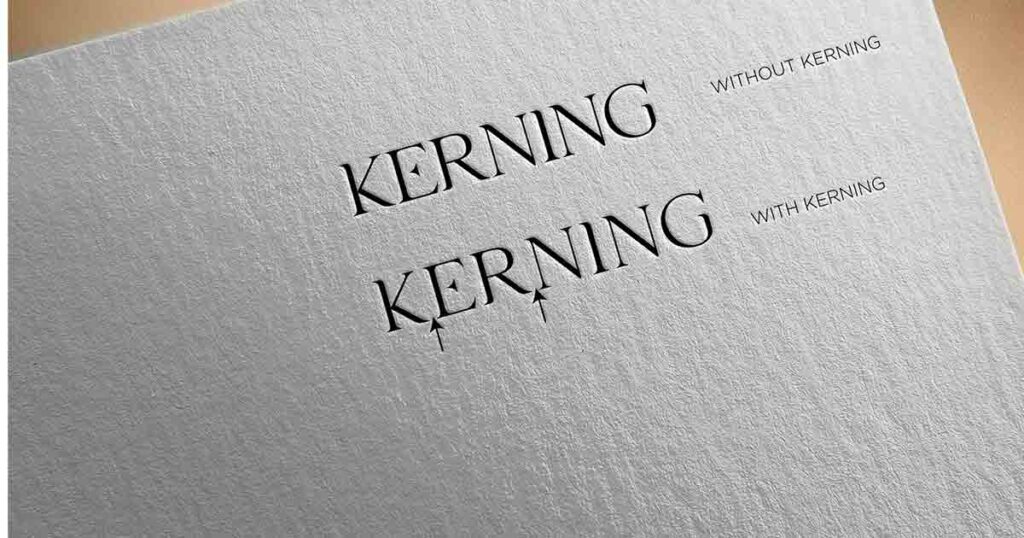
Kerning, in particular, focuses on adjusting the space between individual letters to create visually balanced and harmonious typography.
What is Kerning?
Kerning involves changing the Spacing between two letters to enhance visual balance.
Kerning aims to achieve even Spacing between letters, creating a balanced and aesthetically pleasing appearance.
It helps prevent unsightly gaps or collisions that can negatively impact the legibility of the text.
Kerning Techniques
There are different techniques used for kerning, including:
- Optical Kerning: Optical kerning is an automatic method where software analyzes the shapes of adjacent letters and adjusts the Spacing accordingly. This technique relies on pre-established kerning pairs and is a valuable initial step in perfecting typography.
- Manual Kerning: Manual kerning involves adjusting the letter spacing by hand. Designers carefully evaluate the relationship between each letter pair and make individual adjustments to achieve the desired visual balance.
- Metric Kerning: Metric kerning relies on the kerning information provided by the typeface designer. It uses predetermined spacing values for letter pairs, which are based on the overall shape and design of the Typeface.
Importance of Kerning
Kerning plays a vital role in enhancing typography’s readability and aesthetics.
Proper kerning ensures letters flow smoothly and maintain consistent Spacing, resulting in comfortable reading experiences.
Well-kerned typefaces create a sense of professionalism and attention to detail, capturing the reader’s attention and improving the overall visual impact of the text.
Factors Affecting Kerning
Several factors influence kerning, including:
- Typeface: Different typefaces have varying letterforms, Spacing, and proportions. These characteristics directly affect the space between each letter and require careful consideration during the kerning process.
- Letterforms: The shape and design of individual letterforms can create unique kerning challenges. For example, certain combinations of letters may visually clash, requiring adjustments to achieve optimal Spacing.
- Spacing: The overall Spacing between words and lines also influences the kerning process. Consistent Spacing throughout the text ensures readability and maintains a cohesive visual appearance.
Common Kerning Mistakes
While kerning is crucial for typography, several common mistakes should be avoided:
- Spacing Inconsistencies: Inconsistent Spacing between letters can lead to a jarring visual experience. Maintaining consistent Spacing throughout the text is essential to create a harmonious and visually pleasing design.
- Letter Collisions: Letter collisions occur when adjacent letters touch or overlap, hindering legibility. Careful kerning ensures letters have sufficient space between them, preventing crashes and improving readability.
Kerning in Different Media
Kerning considerations vary across media, including print, web, and mobile applications. In print, designers have more control over the final output, allowing them to fine-tune the kerning for optimal readability.
However, on the web and mobile platforms, where responsive design is crucial, designers must adapt the kerning to ensure legibility across different devices and screen sizes.
Best Practices for Kerning
To achieve effective kerning, designers should consider the following best practices:
- Pay Attention to Context: Consider the overall context in which the typography will be used. The text’s intended audience, medium, and purpose should guide your kerning decisions.
- Maintain Consistency: Consistent Spacing and kerning throughout the text contribute to readability and visual harmony. Avoid excessive variations in Spacing, as they can disrupt the flow of the text.
- Test and Iterate: Regularly test your typography at different sizes and viewports to ensure legibility across various devices and media. Iterate and refine the kerning as needed.
Future Trends in Kerning
As technology advances, the field of kerning continues to evolve. Automated kerning tools using machine learning algorithms are being developed to analyze and adjust letter spacing automatically.
These advancements will streamline the kerning process and allow designers to focus on more creative aspects of typography.
Conclusion
Kerning plays a fundamental role in typography, ensuring legibility, readability, and aesthetic appeal.
By adjusting the space between letters, designers can create visually harmonious and engaging typography.
Understanding the importance of kerning, mastering the techniques, and using appropriate tools will empower designers to create impactful and visually pleasing typography.
FAQs
1: What is the difference between kerning and tracking?
Kerning is the process of fine-tuning the Spacing between specific pairs of letters, while tracking refers to adjusting the overall Spacing between all letters in a text block.
Kerning targets specific letter combinations, whereas tracking affects the overall Spacing uniformly.
2: Can kerning affect the legibility of a text?
Yes, improper kerning can negatively impact the legibility of a text. Poorly spaced letters may lead to collisions or inconsistent Spacing, making the text more challenging to read.
3: How can I improve my kerning skills?
Improving kerning skills requires practice and attention to detail. Study well-kerned typefaces, experiment with different letter combinations, and seek feedback from other designers or typographers.
4: Is kerning equally important for all typefaces?
Yes, kerning is important for all typefaces. However, the extent of kerning required may vary depending on the characteristics and design of each Typeface.
5: Are there any automated kerning tools available?
Yes, various typography software and applications offer automatic kerning features. These tools can assist designers in streamlining the kerning process and achieving optimal Spacing effortlessly.