The Role of Hierarchy in Typography
The Role of Hierarchy in Typography
Typography plays a vital role in design, shaping how content is perceived and understood.
It goes beyond choosing attractive fonts; it involves creating an effective hierarchy to guide readers through the text.
The typography hierarchy actively determines the order of presenting information, actively emphasizes key elements, and actively establishes a visual flow
This article will explore the significance of Hierarchy in typography and its impact on readability, user experience, and branding.
Introduction
In the design world, typography is a powerful tool to communicate ideas, evoke emotions, and enhance aesthetic appeal.
It encompasses the art and technique of arranging type, but it’s more than just picking fonts that look good together.
Typography involves a thorough understanding of Hierarchy, ensuring readers can navigate and comprehend content effortlessly.
Understanding Hierarchy in Typography
What is Hierarchy?
Hierarchy refers to the organization and prioritization of content elements based on their importance.
Typography involves presenting information in a structured manner, leading the reader’s Eye from the most significant details to the finer ones.
By establishing a clear hierarchy, designers guide readers through the content, highlighting key messages and facilitating comprehension.
Why is Hierarchy important in typography?
Hierarchy is crucial because it provides structure and order to the text, making it easier for readers to navigate and absorb information.
Text can appear cluttered and overwhelming without Hierarchy, leading to confusion and disengagement.
With a well-defined hierarchy, readers can quickly identify headings, subheadings, and body text, enabling them to grasp the main points and navigate the content effortlessly.
How Hierarchy Guides the Reader’s Eye
An effective hierarchy directs the reader’s attention to the essential elements and then progressively to the supporting details.
Visual cues like font size, weight, style, and color create an optical flow.
By strategically applying these elements, designers guide the reader’s Eye through the content, ensuring a smooth reading experience.
Elements of Hierarchy
In typography, several elements contribute to the establishment of a hierarchy.
These elements collaborate harmoniously to form a visually captivating composition and ensure the reader’s attention is appropriately directed.
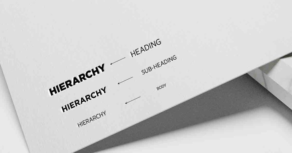
Headings and subheadings
Headings and subheadings play a crucial role in defining the Hierarchy of information.
They provide structure and separate sections, helping readers understand the organization of the content.
Typically, headings are set in more extensive and bolder fonts to distinguish them from the body text, while subheadings are styled to show a slightly lower level of importance.
Body text
The body text forms the core of the content and should be designed with legibility and readability in mind.
It is set in a font that is comfortable to read at various sizes, ensuring the text flows smoothly from one line to another.
To reinforce the Hierarchy, the body text should contrast size and weight with the headings and subheadings.
Emphasis and Hierarchy
Within a text, certain words or phrases may require emphasis to draw attention. It could be achieved using italics, bold, or underlining.
By employing such techniques sparingly, designers can create subtle shifts in the Hierarchy, highlighting specific information without overwhelming the overall composition.
Color and Hierarchy
Color is a powerful tool in establishing Hierarchy. Designers can visually separate content and convey importance using different colors for headings, subheadings, and body text.
Color contrast can be used strategically to distinguish between elements, naturally guiding the reader’s Eye.
Types of Hierarchy
Hierarchy can be implemented in various ways, depending on the desired effect and the presented content.
Here are three common types of Hierarchy in typography:
Hierarchical order
Hierarchical order refers to the traditional top-down approach to organizing information.
In this type of Hierarchy, the most important elements are positioned at the top, followed by subheadings and supporting details.
This type of Hierarchy is commonly used in articles, reports, and other text-heavy documents.
Sequential Hierarchy
Sequential Hierarchy is used when information needs to be presented in a specific order or sequence.
It is often employed in instructional materials, step-by-step guides, or narratives.
Sequential Hierarchy ensures readers follow a logical progression through the content, preventing confusion or missing essential details.
Visual Hierarchy
Visual Hierarchy relies on visual cues to guide the reader’s attention.
It uses various design elements such as font size, weight, color, and spacing to create a visual flow.
Visual Hierarchy is commonly employed in advertisements, posters, and web design to capture the reader’s interest and direct their focus to critical messages.
The Role of Hierarchy in Readability and User Experience
An effective hierarchy significantly improves readability and enhances the overall user experience.
By organizing content structure, designers can reduce cognitive load and help readers easily navigate the text.
Enhancing readability through the Hierarchy
A well-implemented hierarchy ensures text is legible and easily scannable.
Readers can quickly locate relevant sections and information by presenting information logically, with obvious distinctions between headings, subheadings, and body text.
It promotes engagement and encourages users to stay on the page for longer.
Organizing content effectively
Hierarchy aids in organizing content effectively, particularly in longer pieces of writing.
By breaking down the text into manageable sections with clear headings and subheadings, designers make it easier for readers to digest information in smaller chunks.
It facilitates comprehension and allows readers to focus on specific areas of interest.
Improving user experience through the Hierarchy
A well-executed hierarchy enhances the user experience by providing a visually pleasing and intuitive interface.
Users can grab the structure and flow of the content, allowing them to navigate the information effortlessly.
A positive user experience encourages repeat visits and promotes positive brand perception.
Best Practices for Implementing Hierarchy
To create an effective hierarchy in typography, designers should consider the following best practices:
Choosing appropriate typefaces
Selecting appropriate typefaces is essential for establishing a clear hierarchy.
Each typeface has its characteristics and conveys a distinct tone.
Designers should choose typefaces that complement the content and align with the intended message. Balancing legibility, aesthetics, and the Hierarchy’s desired effect is important.
Establishing a clear visual hierarchy
A strong visual hierarchy ensures readers can easily differentiate between headings, subheadings, and body text.
Designers should use a combination of font sizes, weights, and styles to create obvious distinctions.
To attract attention, prioritize giving greater visual weight to essential elements while presenting supporting details subtly.
Balancing consistency and Creativity
While Hierarchy provides structure, designers should consider creative ways to engage readers.
Consistency in typography helps establish a unified visual language throughout the content, making it easier to follow.
However, designers can introduce creative variations within the Hierarchy to add visual interest and prevent monotony.
Using whitespace strategically
Whitespace, or negative space, is vital in creating a balanced hierarchy.
By incorporating ample whitespace around headings, subheadings, and paragraphs, designers can enhance readability and allow readers to focus on specific content.
Whitespace also helps separate different sections, contributing to the overall visual organization.
Hierarchy in Different Design Mediums
Hierarchy in typography applies to various design mediums, including print, web, and mobile.
While the principles remain the same, each medium has specific considerations.
Print design
In print design, Hierarchy is essential for guiding readers through physical documents such as books, magazines, brochures, and posters.
Type size, font selection, and layout are crucial in creating an effective hierarchy that captures attention and delivers the intended message.
Web design
Hierarchy is important in web design because of the dynamic nature of digital content.
Web designers must consider responsive layouts, screen sizes, and user interactions.
Clear headings, ample whitespace, and a logical visual flow help users navigate websites, find desired information quickly, and have a positive browsing experience.
Mobile design
With the rise of mobile devices, designing for smaller screens presents unique challenges.
Mobile design requires condensed content and concise messaging.
Hierarchy is crucial in ensuring that essential information is easily accessible and users can navigate through limited screen space effectively.
The Impact of Hierarchy on Branding
Hierarchy in typography also has a significant impact on branding.
Companies can strengthen their brand identity and differentiate themselves from competitors by employing a consistent hierarchy across various brand touchpoints.
Consistency in brand messaging
A consistent hierarchy reinforces brand messaging and creates a cohesive visual language.
Companies establish a recognizable and unified brand identity using the same typography hierarchy in marketing materials, websites, social media, and other brand assets.
Creating a memorable brand identity
A well-executed hierarchy contributes to a memorable brand identity.
By incorporating distinct typography elements into a consistent hierarchy, companies can create a visual signature that resonates with their target audience.
A memorable brand identity enhances brand recognition and recall.
Differentiating from competitors
Typography hierarchy can be a decisive differentiating factor in a competitive market.
By implementing a unique and effective hierarchy, companies can stand out from their competitors, create a memorable impression, and establish themselves as industry leaders.
Effective Use of Hierarchy
Let’s explore a few case studies to understand how effective Hierarchy can elevate the impact of typography:
Example 1: Editorial Design
A strong hierarchy is essential in a magazine layout to guide readers through different articles.
Clear headings, subheadings, and body text help readers navigate the content effortlessly.
Using varying font sizes, weights, and styles, designers create a visual hierarchy that distinguishes between headlines, captions, and body text, making the reading experience engaging and enjoyable.
Example 2: Website Design
A well-designed website employs Hierarchy to direct users’ attention and facilitate easy navigation.
Clear and visually distinct headings enable users to scan the content and locate specific information.
Designers highlight vital messages and call-to-action elements using different font sizes and weights, driving user engagement and conversion.
Example 3: Branding Design
Hierarchy is crucial in conveying the brand’s values and personality in branding.
Consistent use of typography hierarchy across brand assets, such as logos, packaging, and marketing materials, establishes a cohesive visual identity.
By strategically employing Hierarchy, designers ensure that important brand messages stand out, leaving a lasting impression on consumers.
Conclusion
Hierarchy in typography is a fundamental aspect of design that significantly impacts readability, user experience, and brand identity.
By understanding and implementing the principles of Hierarchy effectively, designers can guide readers through content, enhance comprehension, and create visually engaging compositions.
Whether in print, web, or mobile design, Hierarchy is pivotal in conveying information, fostering engagement, and leaving a lasting impression on audiences.
Frequently Asked Questions (FAQs) The Role of Hierarchy in Typography
Q. How does Hierarchy affect the user’s reading experience?
Hierarchy significantly improves the user’s reading experience by organizing content in a structured manner, making it easier to navigate and comprehend.
Q. Can I use multiple typefaces within a hierarchy?
Limiting the number of typefaces within a hierarchy is recommended to maintain visual consistency. However, various typefaces can be effective tastefully and with a clear design purpose.
Q. Which tools or software can help create a Hierarchy in typography?
Various graphic design software such as Adobe InDesign, Illustrator, and Canva provides tools and features to help create and manage typography hierarchies.
Q. How does Hierarchy impact accessibility in design?
Hierarchy improves accessibility by organizing content and guiding readers through the information. It helps users with unique abilities to navigate and comprehend content more easily.
Q. Is Hierarchy equally crucial in all design projects?
Hierarchy is essential in most design projects where information needs to be communicated effectively. However, the specific application and medium may influence the degree of Hierarchy required.
The Role of Hierarchy in Typography