The Power of Contrast in Typography
The Role of Contrast in Typography
Typography is crucial in design, influencing how information is perceived and communicated.
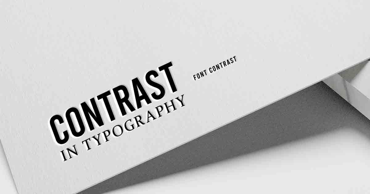
In typography, contrast is a fundamental element that significantly impacts text’s legibility, readability, and overall visual impact.
By understanding and effectively using contrast, designers can create engaging and compelling typographic compositions that capture readers’ attention and convey messages.
This article delves into the different facets of contrast in typography, its significance, and best practices for leveraging difference to enhance the effectiveness of textual communication.
Introduction
Typography, often called the art of arranging type, involves selecting and arranging visual elements such as fonts, sizes, colors, and spacing to communicate a message effectively.
It plays a pivotal role in various design disciplines, including graphic design, web design, advertising, and branding.
Properly using contrast in typography is vital to achieving optimal legibility, readability, and visual impact in any typographic composition.
Understanding Contrast in Typography
Contrast, in typography, refers to the deliberate variation between different typographic elements to create visual interest, separation, and emphasis.
It involves manipulating factors such as font styles, font sizes, font weights, and colors to establish a distinction between distinct elements of the text.
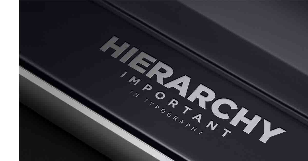
Contrast allows designers to guide the reader’s eye, establish a visual hierarchy, and evoke specific emotions or responses.

Types of Contrast in Typography
The contrast in Font Styles:
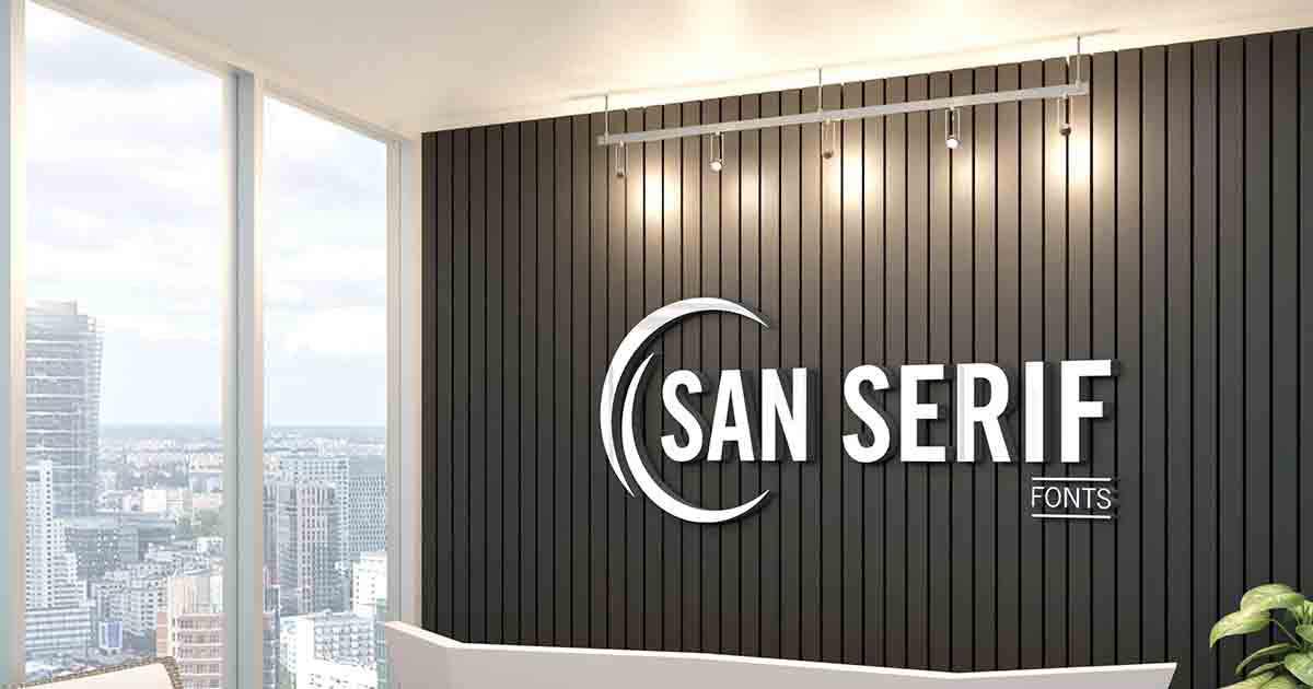
- Serif vs. Sans-serif: The choice between serif and sans-serif fonts creates a visual contrast that evokes different moods and conveys distinct characteristics.
- Bold vs. Regular: Contrasting bold and regular font styles can emphasize essential words or phrases, drawing attention to specific elements within the text.
The Contrast in Font Sizes:
- Heading vs. Body Text: Varying the font sizes of headings and body text helps create a clear visual hierarchy, allowing readers to distinguish different levels of information quickly.
The contrast in Font Weights:
- Light vs. Heavy: Combining light and heavy font weights adds visual interest and can emphasize specific sections or words, making them stand out.
The contrast in Colors:
- Foreground vs. Background: Choosing contrasting colors for the text and background ensures readability and visual impact.
High contrast between the text and background enhances legibility, especially for individuals with visual impairments.
Enhancing Readability with Contrast
One of the primary purposes of contrast in typography is to enhance readability.
By carefully selecting and applying contrast, designers can improve the clarity and legibility of text, making it easier for readers to absorb information.
Contrast helps establish a visual hierarchy, allowing readers to identify headings, subheadings, and body text quickly.
Contrasting ensures the text is visually engaging and easy to navigate.
Creating Visual Impact with Contrast
- Besides improving readability, the contrast in typography can also create a powerful visual impact.
- By strategically applying contrast, designers can draw attention to specific elements, evoke emotions, and communicate messages more effectively.
- Contrast can create focal points, guide the reader’s eye, and highlight critical information.
- It is an essential tool for establishing a unique and visually appealing design.
Best Practices for Using Contrast in Typography
To make the most of contrast in typography, it is vital to follow some best practices:
- Consistency in Contrast: Maintain consistency in contrast choices throughout a typographic composition to create a cohesive and harmonious design.
- Consider the Target Audience and Purpose: Consider the preferences, needs, and characteristics of the target audience, as well as the purpose and context of the typography.
- Testing and Refining: Continuously refine contrast choices to ensure optimal readability, legibility, and visual impact.
- Choosing Font Pairings: Select font pairings that create a harmonious balance of contrast, complementing each other while retaining readability and coherence.
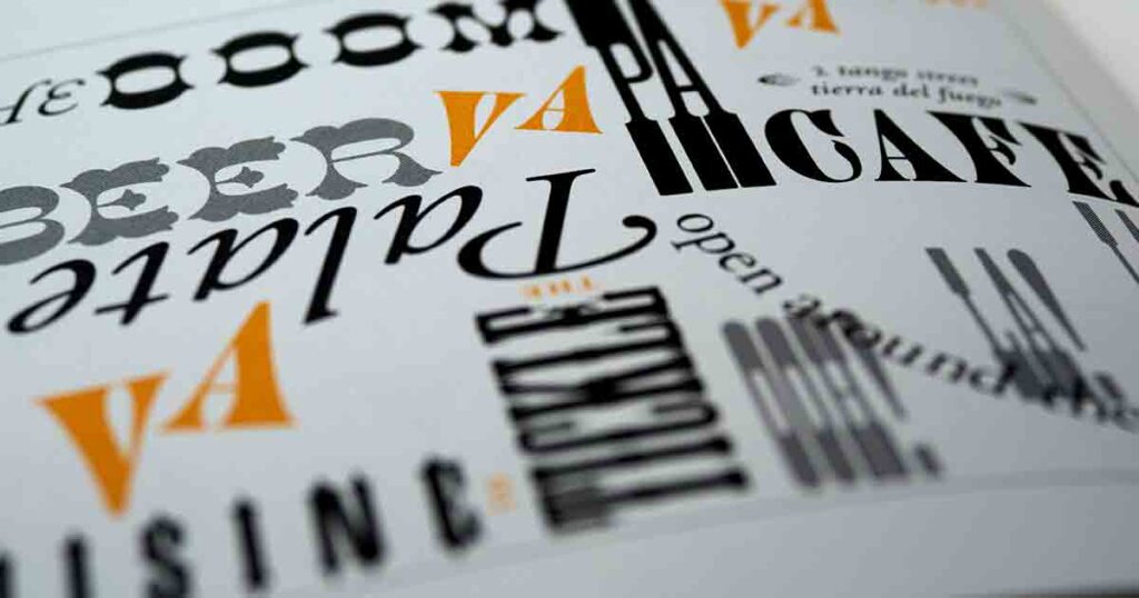
Case Studies: Examples of Effective Contrast in Typography
Let’s explore some real-world examples where effective contrast in typography has significantly contributed to the design’s success.
These case studies show how contrast can apply to different design scenarios and provide inspiration for incorporating contrast into your typographic compositions.
The contrast in Digital and Print Media
The contrast in typography takes on unique considerations in digital and print media.
While the fundamental principles remain the same, each medium has specific challenges and opportunities.
Digital typography must account for screen resolutions, accessibility standards, and responsive design, while print typography can leverage paper and ink’s tactile and physical qualities.
Future Trends and Innovations in Typography Contrast
As design and technology evolve, new trends and innovations in typography continue to emerge.
The future holds exciting possibilities for the use of contrast in typography.
Some emerging techniques and technologies include variable fonts, kinetic typography, and immersive experiences.
Designers and typographers are exploring these innovations to push the boundaries of contrast and create unique and engaging typographic designs.
Conclusion
Typography relies heavily on contrast, significantly influencing how readers perceive and engage with the text.
By leveraging contrast effectively, designers can enhance readability, establish visual hierarchy, and create compelling and impactful typographic compositions.
Using contrast improves communication, captures attention, and elevates the overall design aesthetic.
Embrace the power of contrast in typography, experiment with different contrast combinations, and unlock the full potential of your typographic designs.
FAQs (Frequently Asked Questions)
1: What is the recommended contrast ratio for optimal readability?
To ensure optimal readability, it is recommended to have the lowest contrast ratio of 4.5:1 between the text and background for standard text and 3:1 for large text (above 24px or 19px bold).
However, higher contrast ratios are preferable to accommodate individuals with visual impairments.
2: How can I create contrast without compromising accessibility?
You can create contrast without compromising accessibility by choosing colors with sufficient contrast ratios, using appropriate font sizes, and considering the legibility of the chosen font styles.
Conducting accessibility tests and seeking feedback from diverse users can help ensure your design is inclusive and accessible.
3: Are there any tools or resources to help me choose contrasting fonts?
Yes, several online tools and resources can help you choose contrasting fonts.
Some popular options include Google Fonts (which provides font pairings based on contrast and aesthetic appeal) and Adobe Typekit (which offers curated font collections and recommendations).
4: Can contrast be used in other design elements besides typography?
Absolutely! Contrast is a versatile design principle that can apply to various elements, including colors, shapes, textures, and images.
Using contrast in combination with typography helps create cohesive and visually engaging designs.
5: Is there a limit to how much contrast should be used in typography?
While contrast is essential for readability and visual impact, it is crucial to strike a balance. Excessive contrast can lead to visual clutter or strain the reader’s eyes.
Aim for contrast that enhances the design’s clarity and aesthetics without overwhelming the viewer.
The Role of Contrast in Typography