
HOW TO MAKE YOUR FONT LOOK PROFESSIONAL
HOW TO MAKE YOUR FONT LOOK PROFESSIONAL
Fonts play a significant role in shaping any written content’s overall aesthetics and readability.
Whether designing a website, creating marketing materials, or even drafting an important document, using professional-looking fonts can make a difference.
This article will look into different strategies and ideas to make your font look skilled and increase the effectiveness of your material.
Introduction
In today’s digital age, where information is abundant, and attention spans are short, presenting your content visually appealing and professional is crucial.
Fonts directly impact how readers perceive and engage with your content.
A well-chosen font can evoke emotions, convey the tone of your message, and enhance the overall user experience.
Choosing the Right Font
When selecting a font, it’s essential to understand the different font categories and their characteristics.
Fonts can be categorized as serif, sans-serif, script, display, or decorative. Each type has its unique features and best use cases.
For instance, serif fonts are often considered more traditional and formal, while sans-serif fonts convey a modern and clean look.
Legibility is a critical factor to consider when choosing a font.
Legible fonts ensure readers can effortlessly consume your content without straining their eyes.
Factors such as letterforms, x-height, spacing, and counter shapes contribute to the overall legibility of a font.
Choosing a readable font is very important, particularly for longer content.
The font you select should align with the purpose and context of your content.
For example, a playful and decorative font might be suitable for a children’s book cover but not for a corporate presentation.
When selecting a font, think about the people you are trying to reach and the message you want to get across.
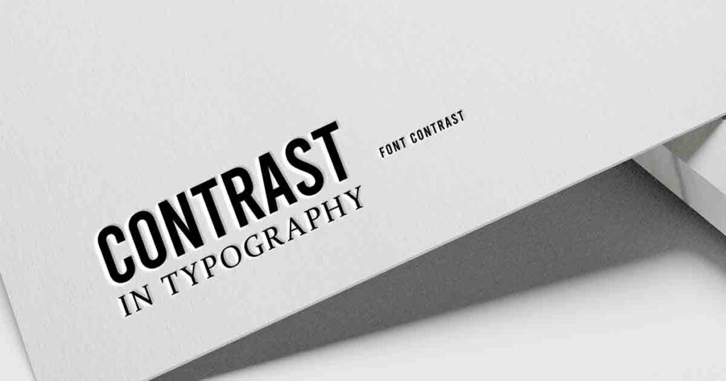
Font Pairing Techniques
Font pairing involves using different fonts together harmoniously and visually pleasingly.
When done right, font pairing can add depth and hierarchy to your content. One common process is to use contrasting fonts for headings and body text.
This contrast creates visual interest and helps guide the reader’s attention.
However, it’s crucial to maintain consistency in font styles throughout your content to avoid visual clutter.
Experimenting with font combinations can also yield interesting results.
Various online resources and tools provide pre-tested font pairings to save time and effort.
These combinations often follow design principles and help create visually balanced and professional-looking typography.
Optimizing Font Size and Line Spacing
The size of your font plays a significant role in determining the readability of your content.
Fonts that are too small can strain the eyes, while fonts that are too large can make your content appear unprofessional.
It’s essential to strike the right balance by selecting an appropriate font size that ensures readability across different devices and screen sizes.
Besides font size, line spacing, also known as leading, is crucial in improving legibility.
Sufficient line spacing helps readers distinguish between lines of text and prevents them from getting lost or skipping lines.
Adjusting the line spacing can significantly enhance the readability of your content, especially for longer paragraphs.
Using Font Styles and Weight
Font styles and weight can strategically emphasize key points and create a visual hierarchy within your content.
Bold and italic styles can draw attention to important information or headings.
However, using these styles sparingly and purposefully is essential to avoid overwhelming the reader.
Font weight is another aspect to consider when making your font look professional.
Different font weights, such as light, regular, medium, bold, and black, can establish a visual hierarchy within your content.
For example, using a bold font for headings and a standard font for body text helps create a clear distinction and guides the reader’s attention.
Considering Font Accessibility
Font accessibility is often overlooked but is crucial for creating inclusive content that can be consumed by all users, including those with visual impairments.
It’s important to choose fonts that are accessible and legible for a wide range of audiences.
Using web-safe fonts or providing accessible alternatives is a good practice to ensure your content is accessible to everyone.
Enhancing Typography with Letter Spacing and Kerning
Letter spacing refers to the change of space between individual characters, while kerning focuses on the spacing between specific pairs of characters.
These typographic adjustments can significantly impact your content’s readability and visual appeal.
Proper letter spacing and kerning help create balanced and visually pleasing text that is easier to read.
Paying Attention to Font Color
Font color is another important consideration when aiming for a professional look.
The color you choose should complement the font and enhance its legibility.
It’s essential to ensure sufficient contrast between the font color and the background to avoid strain on the reader’s eyes.
Consider the overall color scheme and the emotions you want to evoke when selecting the font color.
Formatting Headings with Heading Tags
Using appropriate heading tags for SEO and visual hierarchy is crucial when structuring your content.
Heading tags, such as H1, H2, H3, and H4, not only help search engines understand the structure of your content but also guide readers through the information.
Using heading tags correctly improves the accessibility and readability of your content, making it more professional and user-friendly.
Proofreading and Testing Fonts
Before finalizing your content, it’s essential to proofread for errors and inconsistencies.
Typos and formatting issues can undermine the professionalism of your content.
Take the time to thoroughly review your text and make any necessary edits or corrections.
Testing your chosen fonts across different devices, screen resolutions, and browsers is crucial.
Fonts can render differently, and it’s essential to ensure that your content maintains its professional appearance across various platforms.
Testing your fonts allows you to address any issues and adjust as needed.
Conclusion
Creating content with a professional-looking font is essential for making a positive impression on your audience.
By understanding font categories, pairing techniques, optimizing font size and spacing, using font styles and weight strategically, considering accessibility, enhancing typography with letter spacing and kerning, paying attention to font color, formatting headings with heading tags, and proofreading and testing fonts, you can elevate the visual appeal and professionalism of your content.
Remember that fonts are powerful tools that shape how your content is perceived.
By making informed choices and implementing best practices, you can ensure your font enhances your message’s overall impact and effectiveness.
FAQs
1. What are some popular professional fonts?
Some popular professional fonts include Arial, Helvetica, Times New Roman, Calibri, and Garamond. T
these fonts are widely used and considered clean, legible, and professional.
2. How do I choose the right font for a logo design?
When choosing a font for a logo design, consider the personality and values you want to convey.
Experiment with different font styles and pairings to find a font that aligns with your company or organization’s overall branding and image.
3. Can I use decorative fonts for body text?
While decorative fonts can add flair and personality to headings or titles, they are generally not recommended for body text.
Decorative fonts can be challenging to read for longer stretches of text and may distract from the content itself.
4. Are there any free resources for font pairing?
Yes, there are several free resources available for font pairing. Websites like Google Fonts, Adobe Fonts, and Font Pair provide curated font combinations that you can use as a starting point for your projects.
5. How can I optimize fonts for mobile devices?
To optimize fonts for mobile devices, ensure that your chosen fonts are responsive and render well on smaller screens.
Test your content on mobile devices and adjust font sizes and line spacing to maintain readability.